
The models all look like they are coming into agreement that we’ll see another Nor’easter next week, however the question is will it be a rain, ice or snow event? To determine a preliminary forecast this far out (5+ days) we turn to ensemble models to better predict these types of events. Because of Chaos Theory, the weather is tough to predict more than a few days out, especially during the winter season!
What is Chaos Theory? You may have heard it 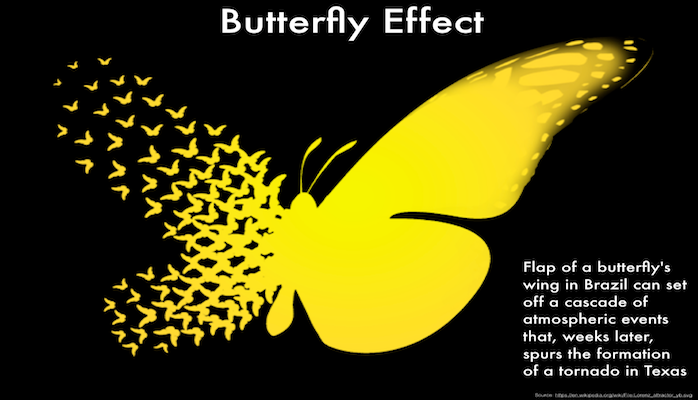 referenced before as the Butterfly Effect; that when a butterfly in Brazil flaps it’s wings, weeks later that could cause a tornado to form in Texas. This example is on the extreme side, but it is a good example for how chaos theory works. To delve a bit further into it, Chaos Theory
  deals with waves. Everything in the atmosphere is a wave, troughs and ridges being the peaks and valleys of said waves. Naturally, waves change shape over time, and as this happens, the outcomes of the waves is harder to predict. In the image to the right, we see a group of waves. They are close together at the start (on the left), but since the waves each vary from one another in just a minor way, as you go further in time (move to the right), each wave takes a different shape and ends up varying a great amount from each other! Since our atmosphere is made of waves, we can then expect the same thing to show up when we try to predict the weather! This is where Ensemble Forecasting comes into play!
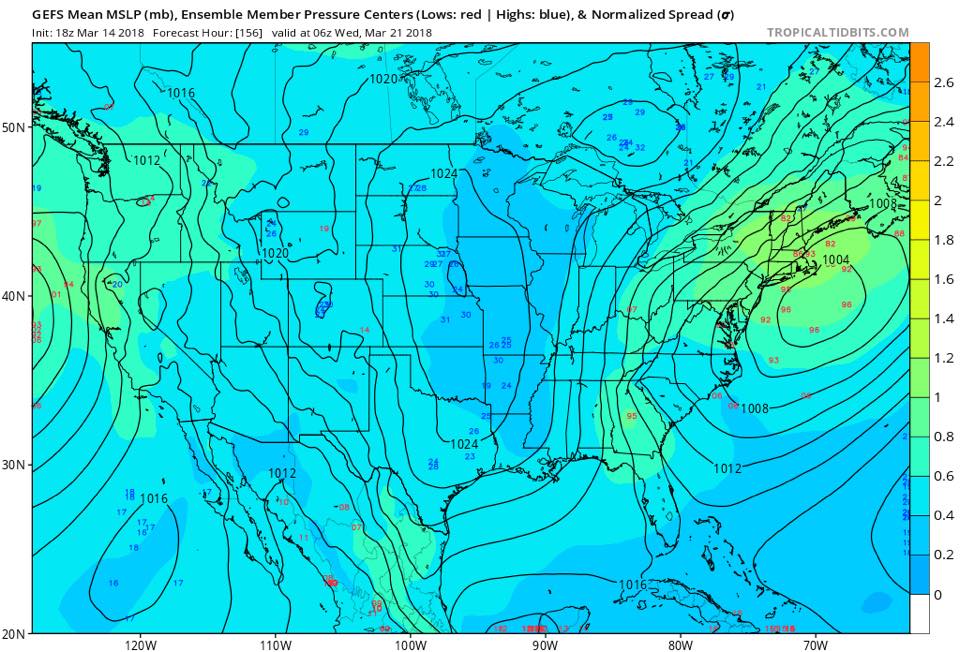
Right now, we are almost a week out and our weather models do not do well predicting precipitation type and amounts that far in advance (The Butterfly Effect (Chaos Theory) is to thank for that!) You can see what I mean in the photo above! The light blue and light green map shows the ensemble mean and spread for the upcoming system. An ensemble model is a group of models (20+ models) each run with a different change made to them (called a perturbation). This allows us to test different solutions based on little changes in atmospheric conditions (The Butterfly Effect in action!). Here we see the red and blue numbers. These show the different locations of areas of high pressure (Blue) and Low pressure (Red). We can see near New England the red numbers are spread out far apart. These all show the different locations of the center of low pressure for our storm. Plotted is the mean, which is the perfect track for a snowy solution. However, all these solutions are possible (minus the most extreme cases) so we could still see the low track close inland or further out to sea. As the days get closer to the event, the ensembles get closer together and we get a better solution.
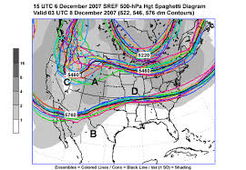

You may have heard of the plot above referenced by tv weatherpersons. This is a spaghetti plot, and shows all the solutions to the different members of the ensemble models. One mean line (in black) is produced based on an average of all the ensemble members. All of these lines represent possible solutions, in this case the location of upper level troughs and ridges, to the starting state of the atmosphere (today’s initial conditions) when a variable is changed. This is why forecasting more than 3 days in advance is tricky! The lines in the spaghetti plots are pretty close together for the first couple of days for the overall models, but as you go further ahead in time, the lines get more wavy (as can be seen in the image above around point C). This is the nature of chaos theory: A small change in a short amount of time will not have the same effect as a small change over a greater amount of time.
So next time you wonder why the weather people keep changing the forecast every day, it is because of Chaos Theory!